Table Of Contents
Accordion
バージョン 1.0.8 で追加.
The Accordion widget is a form of menu where the options are stacked either vertically or horizontally and the item in focus (when touched) opens up to display its content.
The Accordion should contain one or many AccordionItem
instances, each of which should contain one root content widget. You’ll end up
with a Tree something like this:
- Accordion
- AccordionItem
- YourContent
- AccordionItem
- BoxLayout
- Another user content 1
- Another user content 2
- BoxLayout
- AccordionItem
- Another user content
- AccordionItem
The current implementation divides the AccordionItem into two parts:
- One container for the title bar
- One container for the content
The title bar is made from a Kv template. We’ll see how to create a new template to customize the design of the title bar.
警告
If you see message like:
[WARNING] [Accordion] not have enough space for displaying all children
[WARNING] [Accordion] need 440px, got 100px
[WARNING] [Accordion] layout aborted.
That means you have too many children and there is no more space to
display the content. This is “normal” and nothing will be done. Try to
increase the space for the accordion or reduce the number of children. You
can also reduce the Accordion.min_space.
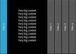
Simple example
from kivy.uix.accordion import Accordion, AccordionItem
from kivy.uix.label import Label
from kivy.app import App


class AccordionApp(App):
    def build(self):
        root = Accordion()
        for x in range(5):
            item = AccordionItem(title='Title %d' % x)
            item.add_widget(Label(text='Very big content\n' * 10))
            root.add_widget(item)
        return root


if __name__ == '__main__':
    AccordionApp().run()
Customize the accordion
You can increase the default size of the title bar:
root = Accordion(min_space=60)
Or change the orientation to vertical:
root = Accordion(orientation='vertical')
The AccordionItem is more configurable and you can set your own title background when the item is collapsed or opened:
item = AccordionItem(background_normal='image_when_collapsed.png',
    background_selected='image_when_selected.png')
-
class
kivy.uix.accordion.Accordion(**kwargs)[ソース]¶ ベースクラス:
kivy.uix.widget.WidgetAccordion class. See module documentation for more information.
-
anim_duration¶ Duration of the animation in seconds when a new accordion item is selected.
anim_durationis aNumericPropertyand defaults to .25 (250ms).
-
anim_func¶ Easing function to use for the animation. Check
kivy.animation.AnimationTransitionfor more information about available animation functions.anim_funcis anObjectPropertyand defaults to ‘out_expo’. You can set a string or a function to use as an easing function.
-
min_space¶ Minimum space to use for the title of each item. This value is automatically set for each child every time the layout event occurs.
min_spaceis aNumericPropertyand defaults to 44 (px).
-
orientation¶ Orientation of the layout.
orientationis anOptionPropertyand defaults to ‘horizontal’. Can take a value of ‘vertical’ or ‘horizontal’.
-
-
class
kivy.uix.accordion.AccordionItem(**kwargs)[ソース]¶ ベースクラス:
kivy.uix.floatlayout.FloatLayoutAccordionItem class that must be used in conjunction with the
Accordionclass. See the module documentation for more information.-
accordion¶ Instance of the
Accordionthat the item belongs to.accordionis anObjectPropertyand defaults to None.
-
background_disabled_normal¶ Background image of the accordion item used for the default graphical representation when the item is collapsed and disabled.
バージョン 1.8.0 で追加.
background__disabled_normalis aStringPropertyand defaults to ‘atlas://data/images/defaulttheme/button_disabled’.
-
background_disabled_selected¶ Background image of the accordion item used for the default graphical representation when the item is selected (not collapsed) and disabled.
バージョン 1.8.0 で追加.
background_disabled_selectedis aStringPropertyand defaults to ‘atlas://data/images/defaulttheme/button_disabled_pressed’.
-
background_normal¶ Background image of the accordion item used for the default graphical representation when the item is collapsed.
background_normalis aStringPropertyand defaults to ‘atlas://data/images/defaulttheme/button’.
-
background_selected¶ Background image of the accordion item used for the default graphical representation when the item is selected (not collapsed).
background_normalis aStringPropertyand defaults to ‘atlas://data/images/defaulttheme/button_pressed’.
-
collapse¶ Boolean to indicate if the current item is collapsed or not.
collapseis aBooleanPropertyand defaults to True.
-
collapse_alpha¶ Value between 0 and 1 to indicate how much the item is collapsed (1) or whether it is selected (0). It’s mostly used for animation.
collapse_alphais aNumericPropertyand defaults to 1.
-
container¶ (internal) Property that will be set to the container of children inside the AccordionItem representation.
-
container_title¶ (internal) Property that will be set to the container of title inside the AccordionItem representation.
-
min_space¶ Link to the
Accordion.min_spaceproperty.
-
orientation¶ Link to the
Accordion.orientationproperty.
-
title¶ Title string of the item. The title might be used in conjunction with the AccordionItemTitle template. If you are using a custom template, you can use that property as a text entry, or not. By default, it’s used for the title text. See title_template and the example below.
titleis aStringPropertyand defaults to ‘’.
-
title_args¶ Default arguments that will be passed to the
kivy.lang.Builder.template()method.title_argsis aDictPropertyand defaults to {}.
-
title_template¶ Template to use for creating the title part of the accordion item. The default template is a simple Label, not customizable (except the text) that supports vertical and horizontal orientation and different backgrounds for collapse and selected mode.
It’s better to create and use your own template if the default template does not suffice.
titleis aStringPropertyand defaults to ‘AccordionItemTitle’. The current default template lives in the kivy/data/style.kv file.Here is the code if you want to build your own template:
[AccordionItemTitle@Label]:
    text: ctx.title
    canvas.before:
        Color:
            rgb: 1, 1, 1
        BorderImage:
            source:
                ctx.item.background_normal \
                if ctx.item.collapse \
                else ctx.item.background_selected
            pos: self.pos
            size: self.size
        PushMatrix
        Translate:
            xy: self.center_x, self.center_y
        Rotate:
            angle: 90 if ctx.item.orientation == 'horizontal' else 0
            axis: 0, 0, 1
        Translate:
            xy: -self.center_x, -self.center_y
    canvas.after:
        PopMatrix
-