Table Of Contents
CheckBox
バージョン 1.4.0 で追加.
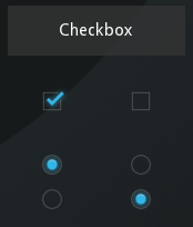
CheckBox is a specific two-state button that can be either checked or
unchecked. If the CheckBox is in a Group, it becomes a Radio button.
As with the ToggleButton, only one Radio button
at a time can be selected when the CheckBox.group is set.
An example usage:
from kivy.uix.checkbox import CheckBox

# ...

def on_checkbox_active(checkbox, value):
    if value:
        print('The checkbox', checkbox, 'is active')
    else:
        print('The checkbox', checkbox, 'is inactive')

checkbox = CheckBox()
checkbox.bind(active=on_checkbox_active)
-
class
kivy.uix.checkbox.CheckBox(**kwargs)[ソース]¶ ベースクラス:
kivy.uix.behaviors.togglebutton.ToggleButtonBehavior,kivy.uix.widget.WidgetCheckBox class, see module documentation for more information.
-
active¶ Indicates if the switch is active or inactive.
activeis aBooleanPropertyand defaults to False.
-
background_checkbox_disabled_down¶ Background image of the checkbox used for the default graphical representation when the checkbox is disabled and active.
バージョン 1.9.0 で追加.
background_checkbox_disabled_downis aStringPropertyand defaults to ‘atlas://data/images/defaulttheme/checkbox_disabled_on’.
-
background_checkbox_disabled_normal¶ Background image of the checkbox used for the default graphical representation when the checkbox is disabled and not active.
バージョン 1.9.0 で追加.
background_checkbox_disabled_normalis aStringPropertyand defaults to ‘atlas://data/images/defaulttheme/checkbox_disabled_off’.
-
background_checkbox_down¶ Background image of the checkbox used for the default graphical representation when the checkbox is active.
バージョン 1.9.0 で追加.
background_checkbox_downis aStringPropertyand defaults to ‘atlas://data/images/defaulttheme/checkbox_on’.
-
background_checkbox_normal¶ Background image of the checkbox used for the default graphical representation when the checkbox is not active.
バージョン 1.9.0 で追加.
background_checkbox_normalis aStringPropertyand defaults to ‘atlas://data/images/defaulttheme/checkbox_off’.
-
background_radio_disabled_down¶ Background image of the radio button used for the default graphical representation when the radio button is disabled and active.
バージョン 1.9.0 で追加.
background_radio_disabled_downis aStringPropertyand defaults to ‘atlas://data/images/defaulttheme/checkbox_radio_disabled_on’.
-
background_radio_disabled_normal¶ Background image of the radio button used for the default graphical representation when the radio button is disabled and not active.
バージョン 1.9.0 で追加.
background_radio_disabled_normalis aStringPropertyand defaults to ‘atlas://data/images/defaulttheme/checkbox_radio_disabled_off’.
-
background_radio_down¶ Background image of the radio button used for the default graphical representation when the radio button is active.
バージョン 1.9.0 で追加.
background_radio_downis aStringPropertyand defaults to ‘atlas://data/images/defaulttheme/checkbox_radio_on’.
-
background_radio_normal¶ Background image of the radio button used for the default graphical representation when the radio button is not active.
バージョン 1.9.0 で追加.
background_radio_normalis aStringPropertyand defaults to ‘atlas://data/images/defaulttheme/checkbox_radio_off’.
-
color¶ Color is used for tinting the default graphical representation of checkbox and radio button (images).
Color is in the format (r, g, b, a). Use alpha greater than 1 for brighter colors. Alpha greater than 4 causes blending border and check mark together.
バージョン 1.10.0 で追加.
coloris aListPropertyand defaults to ‘[1, 1, 1, 1]’.
-