Table Of Contents
Popup
バージョン 1.0.7 で追加.
The Popup widget is used to create modal popups. By default, the popup
will cover the whole “parent” window. When you are creating a popup, you
must at least set a Popup.title and Popup.content.
Remember that the default size of a Widget is size_hint=(1, 1). If you don’t want your popup to be fullscreen, either use size hints with values less than 1 (for instance size_hint=(.8, .8)) or deactivate the size_hint and use fixed size attributes.
バージョン 1.4.0 で変更: The Popup class now inherits from
ModalView. The Popup offers a default
layout with a title and a separation bar.
Examples
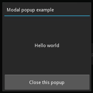
Example of a simple 400x400 Hello world popup:
popup = Popup(title='Test popup',
    content=Label(text='Hello world'),
    size_hint=(None, None), size=(400, 400))
By default, any click outside the popup will dismiss/close it. If you don’t
want that, you can set
auto_dismiss to False:
popup = Popup(title='Test popup', content=Label(text='Hello world'),
              auto_dismiss=False)
popup.open()
To manually dismiss/close the popup, use
dismiss:
popup.dismiss()
Both open() and
dismiss() are bindable. That means you
can directly bind the function to an action, e.g. to a button’s on_press:
# create content and add to the popup
content = Button(text='Close me!')
popup = Popup(content=content, auto_dismiss=False)

# bind the on_press event of the button to the dismiss function
content.bind(on_press=popup.dismiss)

# open the popup
popup.open()
Popup Events
There are two events available: on_open which is raised when the popup is opening, and on_dismiss which is raised when the popup is closed. For on_dismiss, you can prevent the popup from closing by explictly returning True from your callback:
def my_callback(instance):
    print('Popup', instance, 'is being dismissed but is prevented!')
    return True
popup = Popup(content=Label(text='Hello world'))
popup.bind(on_dismiss=my_callback)
popup.open()
-
class
kivy.uix.popup.Popup(**kwargs)[ソース]¶ ベースクラス:
kivy.uix.modalview.ModalViewPopup class. See module documentation for more information.
Events: - on_open:
Fired when the Popup is opened.
- on_dismiss:
Fired when the Popup is closed. If the callback returns True, the dismiss will be canceled.
-
content¶ Content of the popup that is displayed just under the title.
contentis anObjectPropertyand defaults to None.
-
separator_color¶ Color used by the separator between title and content.
バージョン 1.1.0 で追加.
separator_coloris aListPropertyand defaults to [47 / 255., 167 / 255., 212 / 255., 1.]
-
separator_height¶ Height of the separator.
バージョン 1.1.0 で追加.
separator_heightis aNumericPropertyand defaults to 2dp.
-
title¶ String that represents the title of the popup.
titleis aStringPropertyand defaults to ‘No title’.
-
title_align¶ Horizontal alignment of the title.
バージョン 1.9.0 で追加.
title_alignis aOptionPropertyand defaults to ‘left’. Available options are left, center, right and justify.
-
title_color¶ Color used by the Title.
バージョン 1.8.0 で追加.
title_coloris aListPropertyand defaults to [1, 1, 1, 1].
-
title_font¶ Font used to render the title text.
バージョン 1.9.0 で追加.
title_fontis aStringPropertyand defaults to ‘Roboto’. This value is taken fromConfig.
-
title_size¶ Represents the font size of the popup title.
バージョン 1.6.0 で追加.
title_sizeis aNumericPropertyand defaults to ‘14sp’.