Table Of Contents
- Widgets(翻訳済み)
- Introduction to Widget(Widgetの紹介)
- Manipulating the Widget tree(Widgetツリーの操作)
- Traversing the Tree(ツリーの横断について)
- Widgets Z Index(widgetの Z インデックスについて)
- Organize with Layouts(レイアウトの編成について)
- Adding a Background to a Layout(背景のレイアウトを追加する)
- Nesting Layouts(ネスティングレイアウト)
- Size and position metrics(サイズと位置の指標について)
- Screen Separation with Screen Manager(スクリーン・マネージャと画面の分離について)
Widgets(翻訳済み)
Introduction to Widget(Widgetの紹介)
|Widget|はKivyのGUIインタフェースの基本ビルディング・ブロックです。|Canvas|に提供され、画面の描画使用できます。Widgetはイベントを受信し、反応します。詳細な説明については|Widget|クラス、またはモジュールのドキュメントを見てください。
Manipulating the Widget tree(Widgetツリーの操作)
KivyのWidgetsはツリー構造をしています。アプリケーションは`root widget`を持っており、`root widget`は独自の children を持ち使用できます。widgerのchildrenは、children アトリビュート、Kivy ListProperty で表示されます。
widgetツリーは、以下の方法で操作できます:
remove_widget(): 子のリストからwidgetを削除しますremove_widget(): 子のリストからwidgetを削除しますclear_widgets(): widgetからすべての子を削除します
例えばBoxLayoutの内側にボタンを追加したい場合は以下のようにします:
layout = BoxLayout(padding=10)
button = Button(text='My first button')
layout.add_widget(button)
ボタンがレイアウトに追加されます。ボタンの親プロパティはレイアウトに設定されます。レイアウトは、その子のリストに追加したボタンを持ちます。レイアウトからボタンを削除するには:
layout.remove_widget(button)
削除すると、ボタンの親プロパティがNoneに設定され、レイアウトは子のリストからボタンを削除します。ウィジェット内のすべての子たちをクリアしたい場合は、clear_widgets()メソッドを使用します。
widgetから子をすべて削除したい場合は、clear_widgets() メソッドを使用します。:
layout.clear_widgets()
警告
何をしているのか本当に分かっていない場合は子を決して操作しないでください。widgetツリーは、graphicツリーに関連付けられています。graphicツリーにそのキャンバスを追加せず、子のリストにwidgetを追加した場合、widgetの子になりますが、画面上に描画されません。 add_widget、remove_widget、clear_widgetの呼び出しに問題がある可能性があります。
Traversing the Tree(ツリーの横断について)
Widgetクラスのインスタンスの children リストのプロパティは、すべての子が含まれています。 簡単にツリーを操作できます。
root = BoxLayout()
# ... add widgets to root ...
for child in root.children:
    print(child)
しかしこれは慎重に使用する必要があります。子のリストを変更する場合は前のセクションで示したのいずれかの方法で、リストのコピーを行う必要があります。
for child in root.children[:]:
    # manipulate the tree. For example here, remove all widgets that have a
    # width < 100
    if child.width < 100:
        root.remove_widget(child)
widgetは、デフォルトでは自分の子のsize/posには影響しません。 pos 属性は(クリーン座標での絶対位置である|RelativeLayout| を使用しない限り、 詳細は後述。)及び size は絶対的な大きさです。
Widgets Z Index(widgetの Z インデックスについて)
widgetの描画の順序は、widgetツリー内のwidgetの位置に基づいています。add_widget の方法は、widgetツリー内の位置を指定するために使用できる index パラメータを取ります:
root.add_widget(widget, index)
低いインデックス付きのwidgetは、高いインデックスを持つものの上に描画されます。特に断りのない限り、後から追加されたwidgetは他よりも上に描画されるように、 index のデフォルトが0であることに注意してください。
Organize with Layouts(レイアウトの編成について)
layout は子のサイズや位置を制御するwidgetの特別な種類です。子たちの自動編成を可能にする異なるレイアウトの種類があります。 レイアウトは size_hint と pos_hint 使用し 、自身の children の size と pos プロパティを決定します。
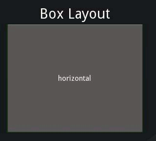
BoxLayout:すべてのスペースを埋めるために、widgetを隣接(垂直または水平)するようにして配置する方法です。 子のsize_hintプロパティは、各子らに許容割合の変更、または一部の固定サイズの設定に使用します。
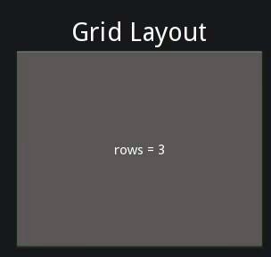
GridLayout: グリッドにウィジェットを配置します。kivyでは、要素のサイズとどのように配置するかを計算できるようにグリッドの寸法を少なくとも1つ指定する必要があります。
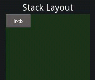
StackLayout: 互いに隣接するwidgetsを配置しますが、いずれかの大きさに設定されたサイズで全体に収まるようにします。これは、同じサイズの子らを表示するのに便利です。
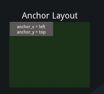
AnchorLayout: シンプルなレイアウトで子らの位置のみを気にするシンプルなレイアウトです。レイアウトの境界の相対的な位置に子らを配置できます。size_hint は適用されません。
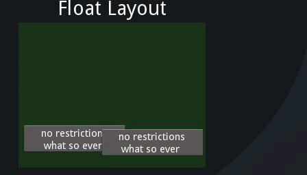
FloatLayout: 絶対座標またはレイアウトのサイズに対してのいずれかで、任意の位置と大きさで子らを配置できます。 デフォルトのsize_hintは(1、1)でレイアウト全体でと子らは同じサイズになりますので複数の子がいる場合、この値を変更したいはずです。size のsize_hintに(None、None)を設定することで絶対的なサイズを使用できます。このwidgetをpos_hintに反映、またはdictとして位置に対しての相対位置を設定します。
RelativeLayout: FloatLayoutと同様のレイアウトですが,ただ1点,FloatLayoutのようにスクリーンに関する絶対座標ではなく,レイアウトに関する相対座標を用いる点が異なります.
レイアウトのより深い理解のために各ドキュメントを参照します。
size_hint は ReferenceListProperty の size_hint_x と size_hint_y です。値の範囲は 0 から 1 または None で、デフォルトは (1, 1) です。これはwidgetがレイアウト内にある場合にレイアウトは可能な限り多くの場所を(レイアウトのサイズを基準にして)両方向に割り当てることを意味します。
size_hint が (0.5, 0.8)に設定されている場合は、layout 内部の Widget で、利用できるサイズの範囲からwidgetの幅が50%、高さが80%に設定されます。
次の例を考えてみます:
BoxLayout:
    Button:
        text: 'Button 1'
        # default size_hint is 1, 1, we don't need to specify it explicitly
        # however it's provided here to make things clear
        size_hint: 1, 1
このように入力してkivyカタログを読み込みますが、$ KIVYDIRをインストールディレクトリに置き換えてください(:py:mod:`os.path.dirname(kivy.__file__)`で検索可能):
cd $KIVYDIR/examples/demo/kivycatalog
python main.py
新しいウィンドウが表示されます。左にある「Welcome」|Spinner| の下の領域をクリックし、そこのテキストをあなたのkvコードで置き換えます。
![../_images/size_hint[B].jpg](../_images/size_hint[B].jpg)
上の画像からわかるように`Button`がレイアウト size の100%になります。
Changing the size_hint_x/size_hint_y to .5 will make the Widget take 50%
of the layout width/height.
![../_images/size_hint[b_].jpg](../_images/size_hint[b_].jpg)
size_hint_x と|size_hint_y| の両方を「.5」にしたものの size_hint_y のみが適用されたように見えます理由は orientation が vertical の時、boxlayout がコントロールするのは|size_hint_y| だからで|orientation| が ‘horizontal’ の時は size_hint_x です。幅と高さのsizeは boxlayout の children の合計に応じて計算されます。この例では子は一人で|size_hint_y| をコントロール(.5/.5 = 1)します。このように、widgetは親のレイアウトの高さの100%を取ります。
他の layout の Button を選択し何が起きるか見てみましょう。
![../_images/size_hint[bb].jpg](../_images/size_hint[bb].jpg)
boxlayout はまさにその性質によって、利用可能な空間を children で均等に分割します。例では2つの children があるので、割合は50-50になります。子らにsize_hintを「1」を使用して結果を見てみましょう。
![../_images/size_hint[oB].jpg](../_images/size_hint[oB].jpg)
子の|size_hint| が指定されている場合は、 |Widget|が|BoxLayout| によって与えられた|size|からスペース が指定されます。この例では最初の Button のために size_hint_x に「0.5」を指定します。widegetのスペースはこのように計算されます。
first child's size_hint divided by
first child's size_hint + second child's size_hint + ...n(no of children)

.5/(.5+1) = .333...
残りの children はBoxLayout内で分割されます。例では Button は layout width で66.66%を占めます。
size_hint に慣れるための実験です。
Widget の 絶対的な|size| を設定するには、size_hint_x/|size_hint_y|のどちらかまたは両方に `None` を指定することでwidgetの |width| また height 属性が反映されます。
pos_hint はデフォルト値は空のdict形式です。 pos_hint のレイアウトの反映は size_hint とは異なりますが、parent の Widget 位置設定に対して、一般的に pos 属性 (x, y, right, top, center_x, center_y)のいずれかに対して値を設定できます。
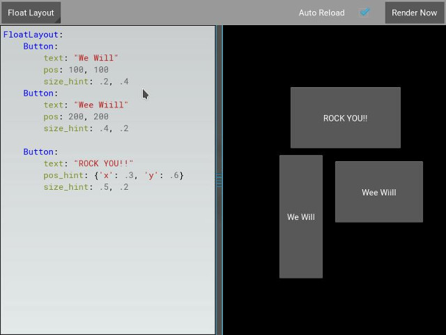
pos_hint を視覚的に理解するためにkivycatalogに次のコードを試してみましょう。
FloatLayout:
    Button:
        text: "We Will"
        pos: 100, 100
        size_hint: .2, .4
    Button:
        text: "Wee Wiill"
        pos: 200, 200
        size_hint: .4, .2

    Button:
        text: "ROCK YOU!!"
        pos_hint: {'x': .3, 'y': .6}
        size_hint: .5, .2
これは以下の効果を与えます。
Adding a Background to a Layout(背景のレイアウトを追加する)
レイアウトに関するよくある質問の1つは、以下のとおり:
"How to add a background image/color/video/... to a Layout"
レイアウトはその性質から視覚的な表現を持っていないです。デフォルトでは何のキャンバス命令を持っていません。 しかし色付きの背景を追加する場合と同様に簡単にレイアウトのインスタンスにキャンバス命令を追加できます。
Pythonの場合:
from kivy.graphics import Color, Rectangle

with layout_instance.canvas.before:
    Color(0, 1, 0, 1) # green; colors range from 0-1 instead of 0-255
    self.rect = Rectangle(size=layout_instance.size,
                           pos=layout_instance.pos)
残念ながら、これが四角形を描画する際の、初期位置とサイズ唯一のレイアウトです。 レイアウトのsize/posの変化は、すべての変更に耳を傾け、四角形のsizeとposを更新する必要がある場合、矩形は、レイアウトの内側に描かれていることを確認します。 次のように行えます:
with layout_instance.canvas.before:
    Color(0, 1, 0, 1) # green; colors range from 0-1 instead of 0-255
    self.rect = Rectangle(size=layout_instance.size,
                           pos=layout_instance.pos)

def update_rect(instance, value):
    instance.rect.pos = instance.pos
    instance.rect.size = instance.size

# listen to size and position changes
layout_instance.bind(pos=update_rect, size=update_rect)
kvの場合:
FloatLayout:
    canvas.before:
        Color:
            rgba: 0, 1, 0, 1
        Rectangle:
            # self here refers to the widget i.e BoxLayout
            pos: self.pos
            size: self.size
kvの宣言は暗黙的に結合を設定します:kvの最後の2行の|pos|と |size|は |FloatLayout| の pos が変化し、矩形の値が更新された時に確認されます。
Kivy Appのシェルにスニペットを配置します。
“Pythonのみでの方法:
from kivy.app import App
from kivy.graphics import Color, Rectangle
from kivy.uix.floatlayout import FloatLayout
from kivy.uix.button import Button


class RootWidget(FloatLayout):

    def __init__(self, **kwargs):
        # make sure we aren't overriding any important functionality
        super(RootWidget, self).__init__(**kwargs)

        # let's add a Widget to this layout
        self.add_widget(
            Button(
                text="Hello World",
                size_hint=(.5, .5),
                pos_hint={'center_x': .5, 'center_y': .5}))


class MainApp(App):

    def build(self):
        self.root = root = RootWidget()
        root.bind(size=self._update_rect, pos=self._update_rect)

        with root.canvas.before:
            Color(0, 1, 0, 1)  # green; colors range from 0-1 not 0-255
            self.rect = Rectangle(size=root.size, pos=root.pos)
        return root

    def _update_rect(self, instance, value):
        self.rect.pos = instance.pos
        self.rect.size = instance.size

if __name__ == '__main__':
    MainApp().run()
kv を使用した場合:
from kivy.app import App
from kivy.lang import Builder


root = Builder.load_string('''
FloatLayout:
    canvas.before:
        Color:
            rgba: 0, 1, 0, 1
        Rectangle:
            # self here refers to the widget i.e FloatLayout
            pos: self.pos
            size: self.size
    Button:
        text: 'Hello World!!'
        size_hint: .5, .5
        pos_hint: {'center_x':.5, 'center_y': .5}
''')

class MainApp(App):

    def build(self):
        return root

if __name__ == '__main__':
    MainApp().run()
Appsの結果は両方とも以下の様になります:
**custom layouts rule/class**の背景に色を追加する
複数のレイアウトを使用する場合、レイアウトのインスタンスに背景を追加する場合はすぐに面倒になります。”れを支援するために、レイアウトをサブクラス化し、背景を追加して独自レイアウトを作成できます。
Pythonを使用:
from kivy.app import App
from kivy.graphics import Color, Rectangle
from kivy.uix.boxlayout import BoxLayout
from kivy.uix.floatlayout import FloatLayout
from kivy.uix.image import AsyncImage
class RootWidget(BoxLayout):
pass
class CustomLayout(FloatLayout):
def __init__(self, **kwargs):
# make sure we aren't overriding any important functionality
super(CustomLayout, self).__init__(**kwargs)
with self.canvas.before:
Color(0, 1, 0, 1) # green; colors range from 0-1 instead of 0-255
self.rect = Rectangle(size=self.size, pos=self.pos)
self.bind(size=self._update_rect, pos=self._update_rect)
def _update_rect(self, instance, value):
self.rect.pos = instance.pos
self.rect.size = instance.size
class MainApp(App):
def build(self):
root = RootWidget()
c = CustomLayout()
root.add_widget(c)
c.add_widget(
AsyncImage(
source="http://www.everythingzoomer.com/wp-content/uploads/2013/01/Monday-joke-289x277.jpg",
size_hint= (1, .5),
pos_hint={'center_x':.5, 'center_y':.5}))
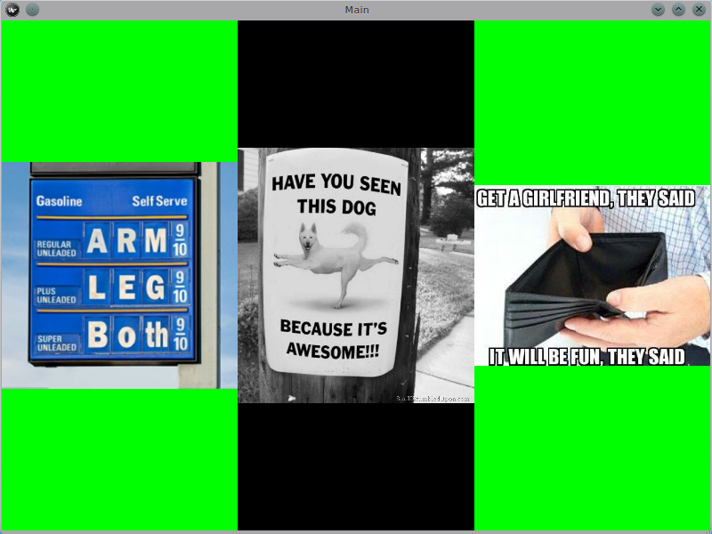
root.add_widget(AsyncImage(source='http://www.stuffistumbledupon.com/wp-content/uploads/2012/05/Have-you-seen-this-dog-because-its-awesome-meme-puppy-doggy.jpg'))
c = CustomLayout()
c.add_widget(
AsyncImage(
source="http://www.stuffistumbledupon.com/wp-content/uploads/2012/04/Get-a-Girlfriend-Meme-empty-wallet.jpg",
size_hint= (1, .5),
pos_hint={'center_x':.5, 'center_y':.5}))
root.add_widget(c)
return root
if __name__ == '__main__':
MainApp().run()
kv を使用した場合:
from kivy.app import App
from kivy.uix.floatlayout import FloatLayout
from kivy.uix.boxlayout import BoxLayout
from kivy.lang import Builder


Builder.load_string('''
<CustomLayout>
    canvas.before:
        Color:
            rgba: 0, 1, 0, 1
        Rectangle:
            pos: self.pos
            size: self.size

<RootWidget>
    CustomLayout:
        AsyncImage:
            source: 'http://www.everythingzoomer.com/wp-content/uploads/2013/01/Monday-joke-289x277.jpg'
            size_hint: 1, .5
            pos_hint: {'center_x':.5, 'center_y': .5}
    AsyncImage:
        source: 'http://www.stuffistumbledupon.com/wp-content/uploads/2012/05/Have-you-seen-this-dog-because-its-awesome-meme-puppy-doggy.jpg'
    CustomLayout
        AsyncImage:
            source: 'http://www.stuffistumbledupon.com/wp-content/uploads/2012/04/Get-a-Girlfriend-Meme-empty-wallet.jpg'
            size_hint: 1, .5
            pos_hint: {'center_x':.5, 'center_y': .5}
''')

class RootWidget(BoxLayout):
    pass

class CustomLayout(FloatLayout):
    pass

class MainApp(App):

    def build(self):
        return RootWidget()

if __name__ == '__main__':
    MainApp().run()
Appsの結果は両方とも以下の様になります:
スタムレイアウトクラスの背景を定義することで、CustomLayoutのすべてのインスタンスでレイアウトが使用されす。
内蔵のKivyレイアウトの背景に画像や色を追加するには、 **globally**に “問題のレイアウトのKVルールをオーバーライドする必要があります。GridLayoutで考えてみましょう:
<GridLayout>
    canvas.before:
        Color:
            rgba: 0, 1, 0, 1
        BorderImage:
            source: '../examples/widgets/sequenced_images/data/images/button_white.png'
            pos: self.pos
            size: self.size
Kivyアプリにスニペットを置くとき:
from kivy.app import App
from kivy.uix.floatlayout import FloatLayout
from kivy.lang import Builder


Builder.load_string('''
<GridLayout>
    canvas.before:
        BorderImage:
            # BorderImage behaves like the CSS BorderImage
            border: 10, 10, 10, 10
            source: '../examples/widgets/sequenced_images/data/images/button_white.png'
            pos: self.pos
            size: self.size

<RootWidget>
    GridLayout:
        size_hint: .9, .9
        pos_hint: {'center_x': .5, 'center_y': .5}
        rows:1
        Label:
            text: "I don't suffer from insanity, I enjoy every minute of it"
            text_size: self.width-20, self.height-20
            valign: 'top'
        Label:
            text: "When I was born I was so surprised; I didn't speak for a year and a half."
            text_size: self.width-20, self.height-20
            valign: 'middle'
            halign: 'center'
        Label:
            text: "A consultant is someone who takes a subject you understand and makes it sound confusing"
            text_size: self.width-20, self.height-20
            valign: 'bottom'
            halign: 'justify'
''')

class RootWidget(FloatLayout):
    pass


class MainApp(App):

    def build(self):
        return RootWidget()

if __name__ == '__main__':
    MainApp().run()
結果は次のようになります:
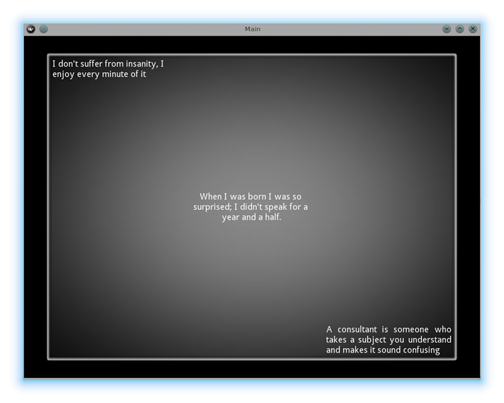
GridLayoutクラスでルールをオーバーライドしているようにアプリでクラスの任意の使用は、画像を表示します。
**Animated background**はどのように表現するか?
特定のテクスチャを使用するためにはRectangle/BorderImage/Ellipse/...のような描画命令を指定します:
Rectangle:
    texture: reference to a texture
アニメーションの背景を表示するために以下を使用します:
from kivy.app import App
from kivy.uix.floatlayout import FloatLayout
from kivy.uix.gridlayout import GridLayout
from kivy.uix.image import Image
from kivy.properties import ObjectProperty
from kivy.lang import Builder


Builder.load_string('''
<CustomLayout>
    canvas.before:
        BorderImage:
            # BorderImage behaves like the CSS BorderImage
            border: 10, 10, 10, 10
            texture: self.background_image.texture
            pos: self.pos
            size: self.size

<RootWidget>
    CustomLayout:
        size_hint: .9, .9
        pos_hint: {'center_x': .5, 'center_y': .5}
        rows:1
        Label:
            text: "I don't suffer from insanity, I enjoy every minute of it"
            text_size: self.width-20, self.height-20
            valign: 'top'
        Label:
            text: "When I was born I was so surprised; I didn't speak for a year and a half."
            text_size: self.width-20, self.height-20
            valign: 'middle'
            halign: 'center'
        Label:
            text: "A consultant is someone who takes a subject you understand and makes it sound confusing"
            text_size: self.width-20, self.height-20
            valign: 'bottom'
            halign: 'justify'
''')


class CustomLayout(GridLayout):

    background_image = ObjectProperty(
        Image(
            source='../examples/widgets/sequenced_images/data/images/button_white_animated.zip',
            anim_delay=.1))


class RootWidget(FloatLayout):
    pass


class MainApp(App):

    def build(self):
        return RootWidget()

if __name__ == '__main__':
    MainApp().run()
何が行われている理解するために13行目から見てみます:
texture: self.background_image.texture
これは BorderImage の texture プロパティは background_image がアップデートのたびに texture プロパティを更新を指定します。 40行目でbackground_imageプロパティを定義します:
background_image = ObjectProperty(...
Image widgetを追加した際に ObjectProperty に`background_image`を設定します。画像widgetは`texture` プロパティを有しています。 self.background_image.texture を参照しすることで、、 `texture`を設定するプロパティの参照をします。 Image widget はアニメーションをサポートしています。アニメーションの変更、およびBorderImage命令の質感がプロセスに更新されるたびに画像のテクスチャが更新されます。
カスタムデータをテクスチャーに作成できます。詳細については Texture のドキュメントを参照してください。
Nesting Layouts(ネスティングレイアウト)
はい! どの程度拡張可能かを見るプロセスは非常に楽しいです。
Size and position metrics(サイズと位置の指標について)
Kivyの長さのデフォルトの単位はピクセルで、すべてのサイズと位置はデフォルトではその中で表現されます。デバイス間でより良い一貫性(ピクセル単位でサイズに自動的に変換されます)を達成するために有効である他の単位で表現できます。
利用可能な単位は、 pt, mm, cm, inch, dp and sp です。詳細は metrics ドキュメントを参照してください。
アプリケーションのための様々なデバイスの画面をシミュレートするために screen 使用して試せます。
Screen Separation with Screen Manager(スクリーン・マネージャと画面の分離について)
アプリケーションが各種の画面で構成されている場合はおそらく簡単な方法としては Screen 別にナビゲートします。幸いなことに ScreenManager クラスは別の画面を定義し、他の画面へは TransitionBase を設定します。